Customer Transformation: Penny's Kitchen
Are you ready to see an amazing customer transformation? Check out Penny's new kitchen!

Here are a few of her before pictures.
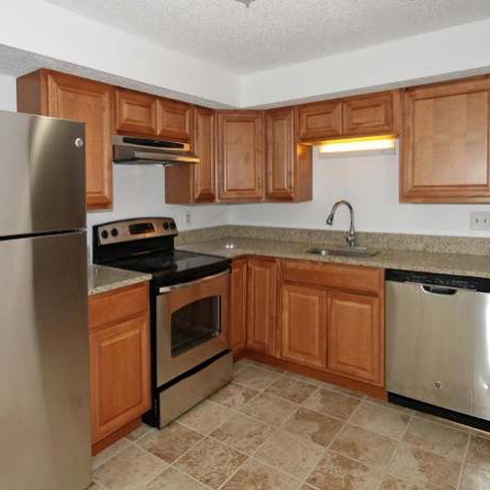
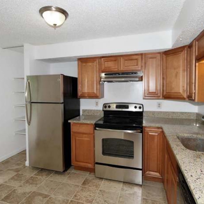
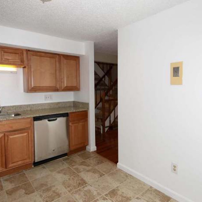
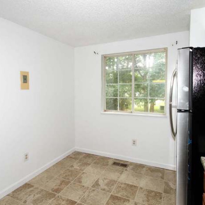
The kitchen had white walls, builder-grade medium finished wood cabinets, standard granite countertops, and a ceramic tile look flooring to complete the room. This kitchen was lacking special touches - something to make it stand out and be a room they wanted to cook in. They could have chosen to just paint the walls and add some gorgeous new cabinet hardware, but they had other plans. Penny was not happy with the blank wall they had and knew she could do something better to make use of the entire kitchen space. Boy, did she ever make excellent use of the space! Ready to see the stunning after results? Here they are!

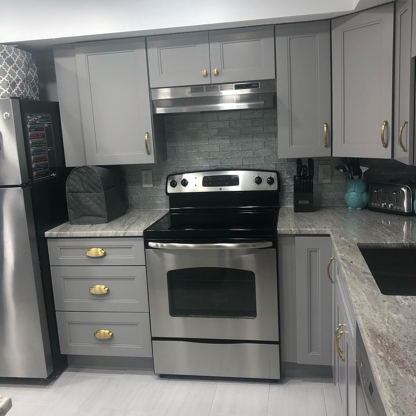
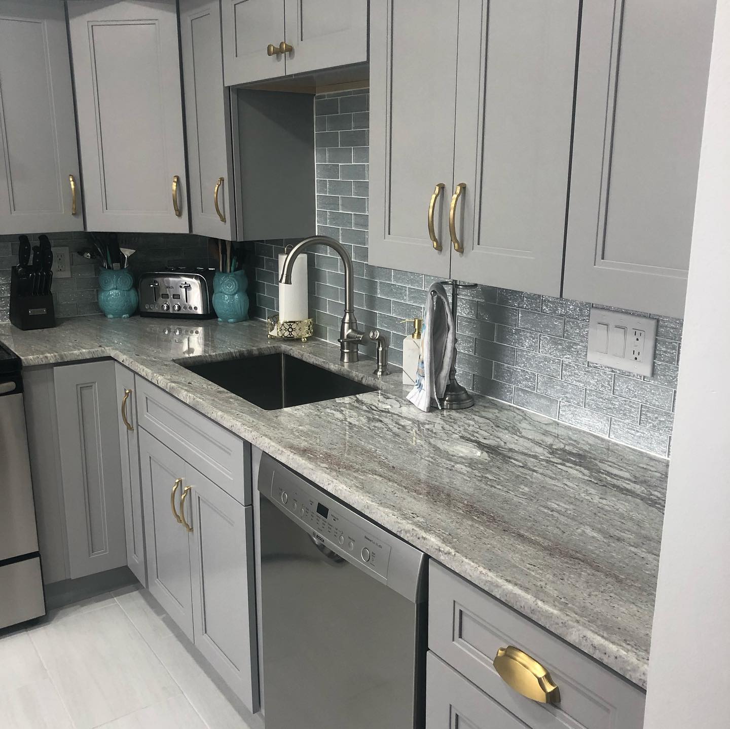
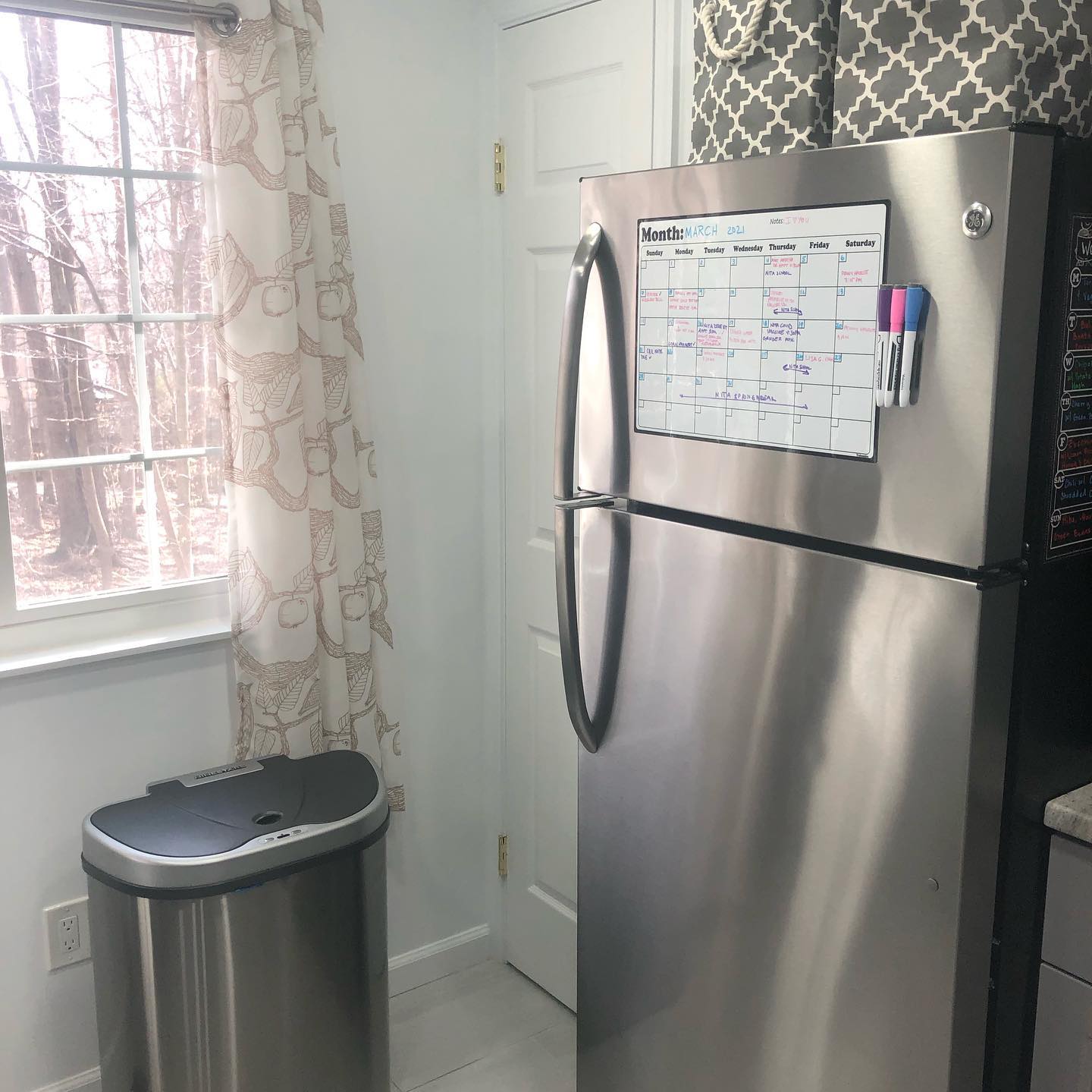
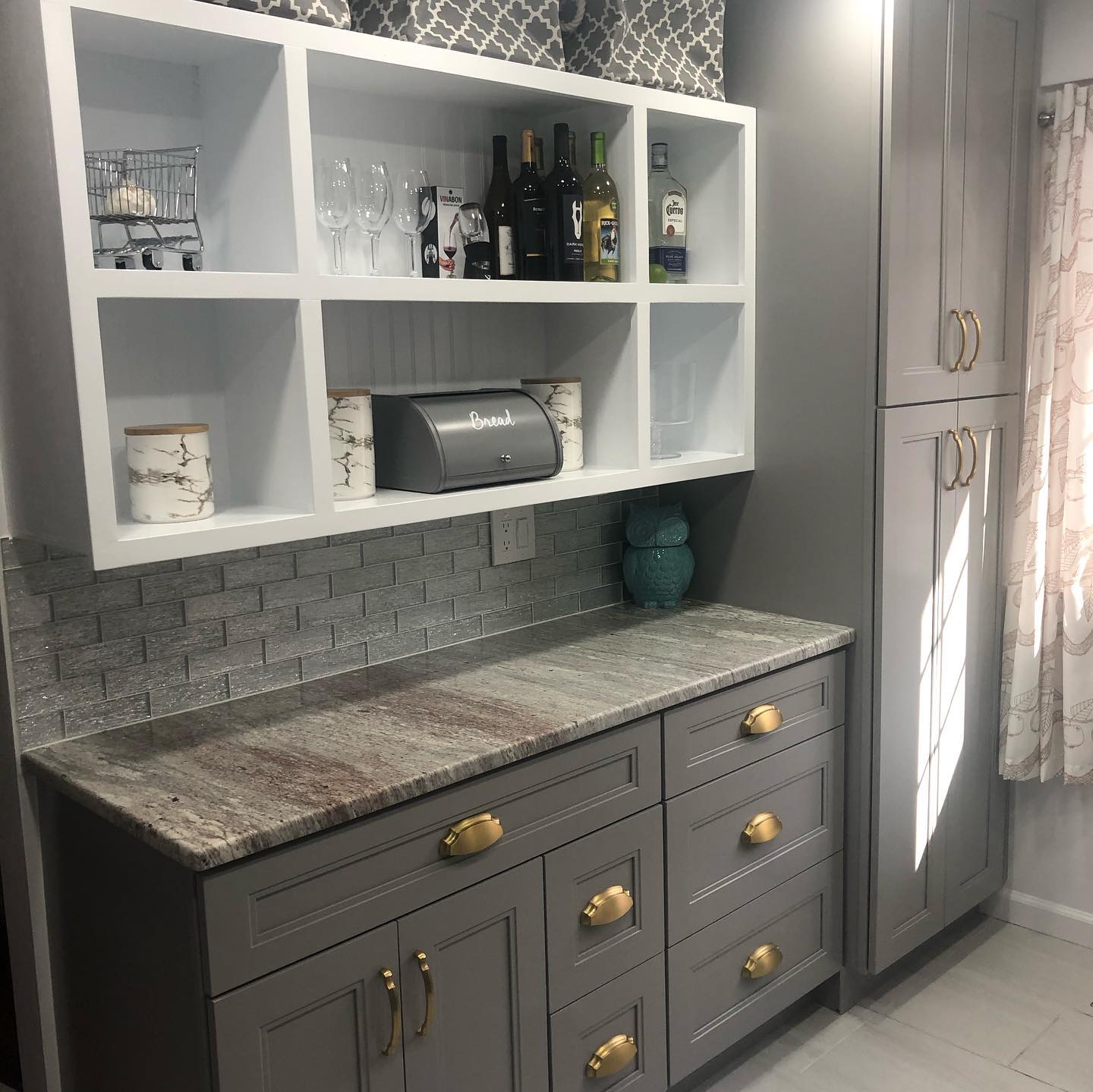
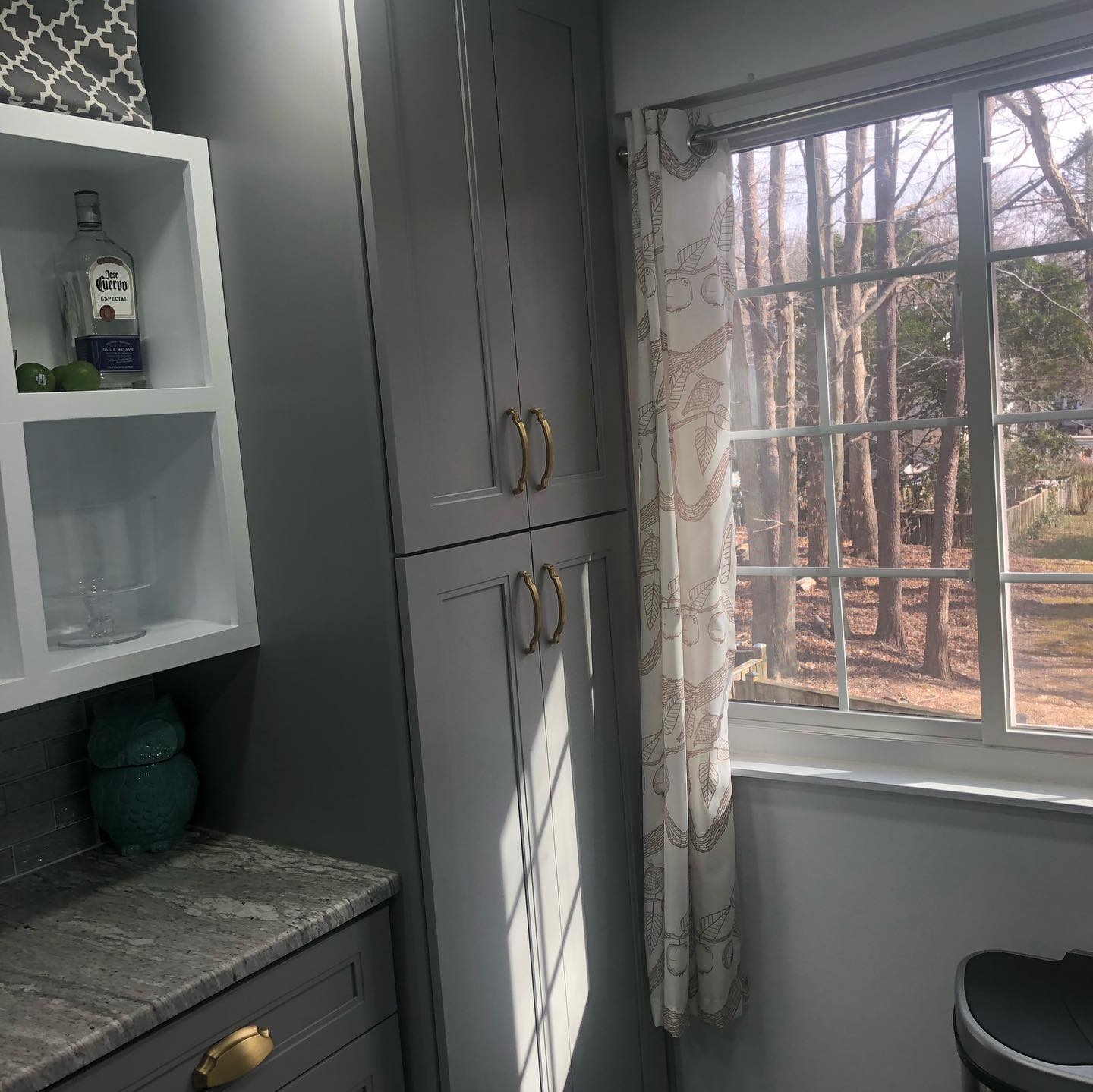
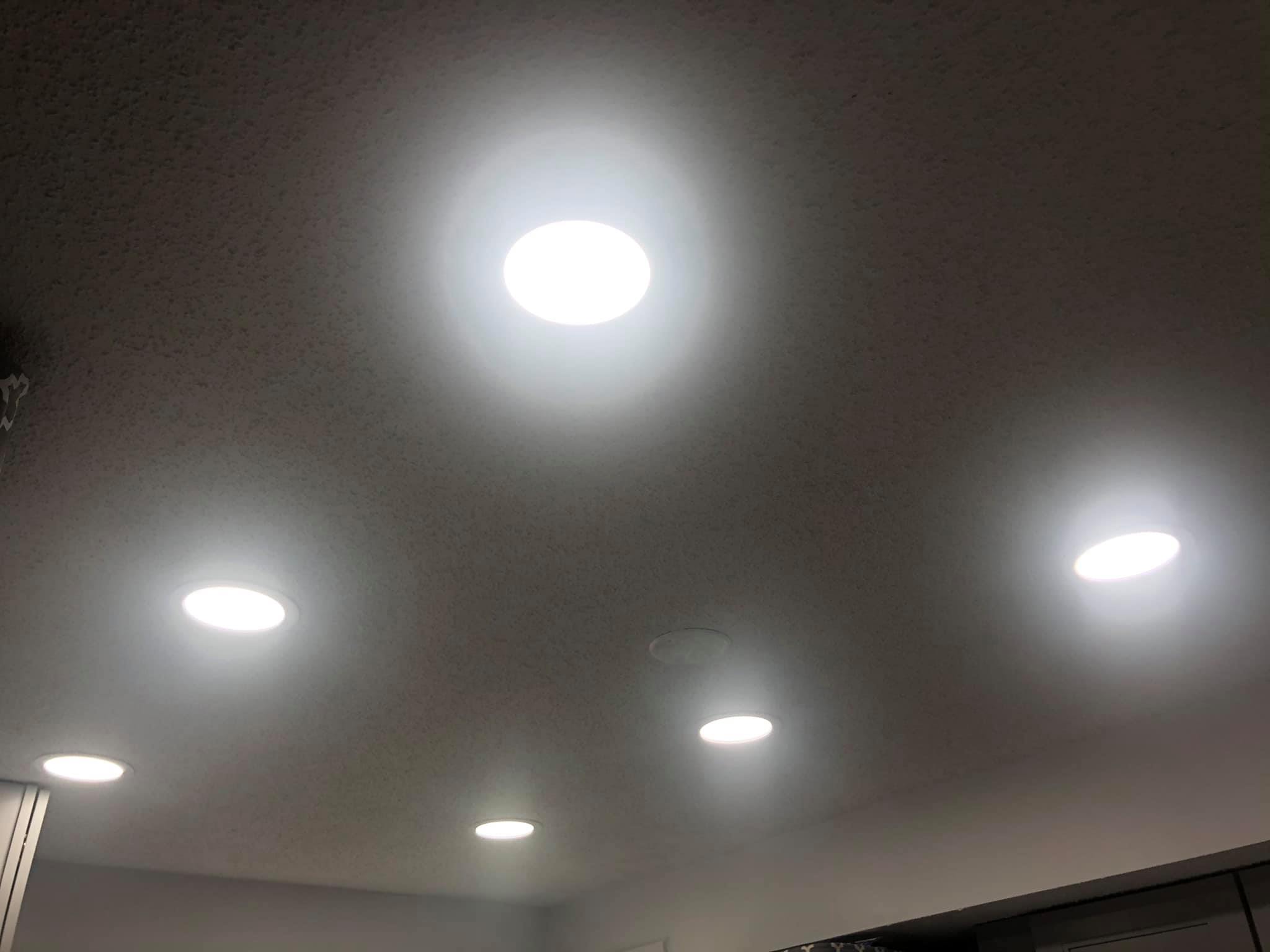
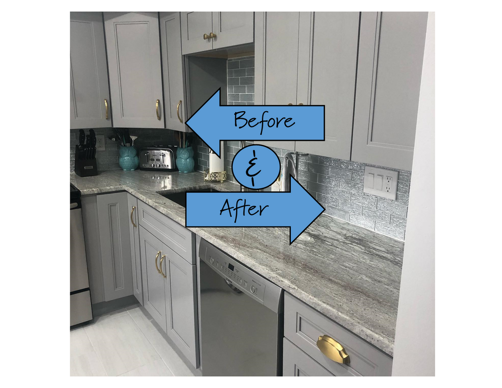
Wow, wow, wow! What a stunning transformation! Penny was kind enough to share all of the details about this transformation, so we can share them with you. In this new dream space, they changed the layout of the kitchen to allow for a new work area and the tall cupboard space by the window. They also maximized the lighting in the room with 6 new recessed can lights as well as added lighting under all of the new upper cabinets. Here are the specifics about the finishes that were used in this new amazing space.
Cabinets:
The cabinets they selected are the Sterling colored Double Edge Shaker style from Jarlin Cabinetry.
Cabinet Hardware:
Penny selected the Veranda collection from Belwith's Hickory Hardware and went with the Brushed Golden Brass finish. We are absolutely in love with the way the finish pops against the grey cabinetry! She used the 5 1/16" (128mm) curved pull - item# BWH-H077864-BGB
She also used the 3" and 3 3/4" (96mm) cup pull from this collection - item# BWH-H077872-BGB
They chose the 1 1/8" knob from this collection - item# BWH-H077861-BGB
Backsplash:
They wanted to use a glass tile backsplash and chose this subway tile from MSI. The color they selected is the Chilcott Bright Subway Tile.
Countertop:
Are you as in love with this granite as we are? We are loving the mix of colors and all the veining throughout the slabs. The color they selected was River White. Stunning!
Sink:
The undermount sink they chose was from Appaso. You can shop their sinks here.
Paint:
The wall color that they selected was from Behr. They went with Bakery Box #BL-W9 that can be seen here. This color is a white tone with hints of grey, blue, and green.
Flooring:
The flooring choice was a glazed porcelain tile from Marazzi. They decided on using a 12" x 24" tile, and they chose the Modern Renewal Parchment color.
Penny, thank you so much for sharing your gorgeous new kitchen! We wish you many happy years in your newly renovated space.
Let us help you find the perfect hardware for your next renovation or updating project. Contact us and we would love to help you out!
Recent Posts
-
Finding the right brass, bronze, and gold family hardware for your home.
There is no denying the popularity of gold toned finishes right now. From kitchens to bathrooms, thi …Feb 27th 2025 -
Customer Transformation: a kitchen update with brushed oil rubbed bronze hardware
We recently worked with Vickie, who was renovating her kitchen and was kind enough to share the comp …Jan 13th 2025 -
Organization and decorating made easy using wall hooks
Many of us are trying to get organized and tidy for the new year. An easy way to help get clutter of …Dec 28th 2024

